WITH UNDERSTANDING “COLOUR WHEEL”, SPREAD SOME COLOURS AROUND
“ Life is art, live yours in color,….” Harley Weir
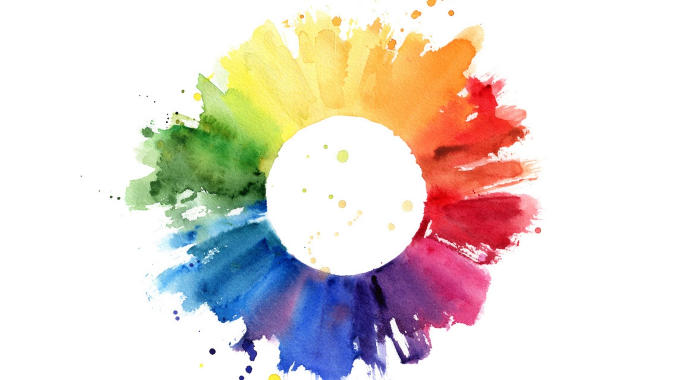
Colour is a form of non-verbal communication that can primarily affect our moods and emotions. So, selecting the colour is very important in every aspect of life. Colour theory is both the art and science of using colour. And now, in colour theory, colours are organized on a wheel and grouped into 3 categories: primary colours, secondary colours and tertiary colours. To understand this colour wheel, we need to know these colours clearly.
Our Primary colors of the color wheel are Red, Blue, and Yellow. A set of primary colors is a basic set of color theories that can be combined in different quantities to somehow produce color. It is a necessary requirement used in applications that try to convey the perception of different sets of colors.
Now to get secondary set of colour, primary colours are used. A secondary colour is a color that mixes two primary colours in place of a given colour. Colours are Orange, Green, Violet.
And there comes tertiary colours, those are being created and filled in colour wheel by mixing primary and secondary colour. There’re six tertiary colours, those are Red-Orange, Yellow-Orange, Yellow-Green, Blue-Green, Blue-Violet, Red-Violet.
And these by filling all three level of colours(12 colours), the colour wheel is filled up. Now, in the wheel draw a line through the centre, and separate colour through nature or colour temperature.
- Warm colours include red, orange and yellow and variations of these three colours. Both red and yellow are as the primary color, with orange is in the second set. Warm colours appear to the observer and these colours are usually associated with energy, brightness and action.
- Cool colours include green, blue and purple and variations of these three colours, where Blue is the only primary color in the cool spectrum. These are often more subdued than warm colours. Cool colours appear far away from the observer and these colours are often characterized by calm, innocence and serenity.
These are complete and brief description of colour wheel.
How to select colour combinations using colour wheel :
Basically, there are some schemes by designers to develop a perfect color combination. And they’re undermentioned.
- Complementary Colour combination: Complementary colours are the opposite of the colour wheel. The sharp contrast of complementary colours creates a vibrant look, especially when used in full saturation. These complementary combinations are hard to use in large doses, but work well when you want something to stand out. However, their overuse can be tedious.

- Analogous colours combination: Analogous colour schemes use colours next to each other to the colour wheel. These usually match well and create a clean and comfortable design and also these uniform colour schemes are often found in nature and it is harmonious and pleasing to the eye.

- Triad color combination: Triadic color tends to be evenly spaced around the color wheel and tends to be very bright and dynamic. However, a careful balance should be maintained. We must choose in such a way that one color can influence and use two for accent.

Either than these, there present a set of neutral colors also like black, brown, white, etc.